creative direction + design
who we are
We are more than just the lottery. We are a part of the fabric of Illinois. A modern brand, full of swagger that is much more than white noise. We are winners, leaders and a champion of the people for this great state.

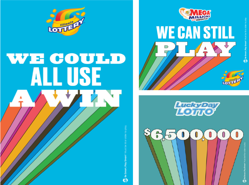
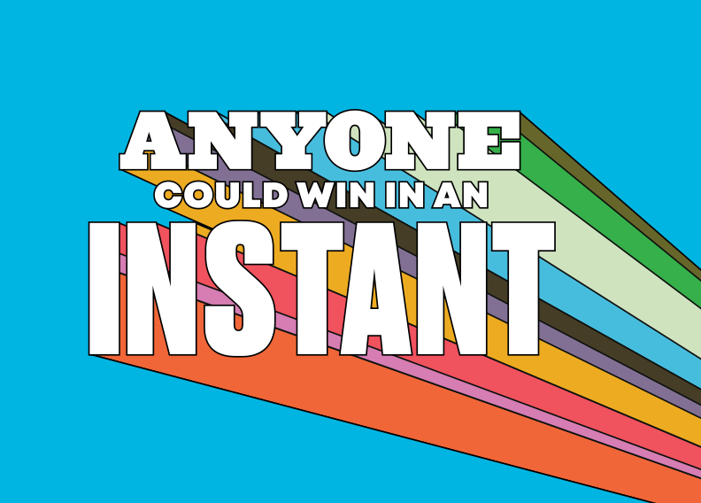
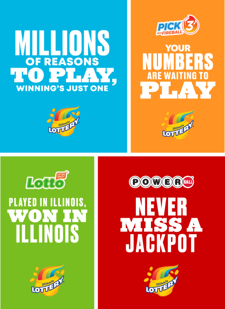
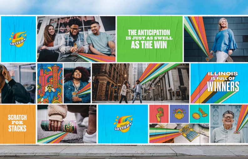
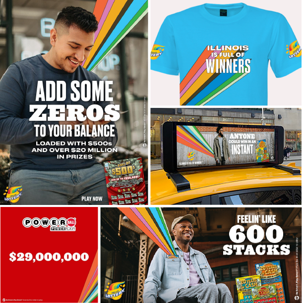
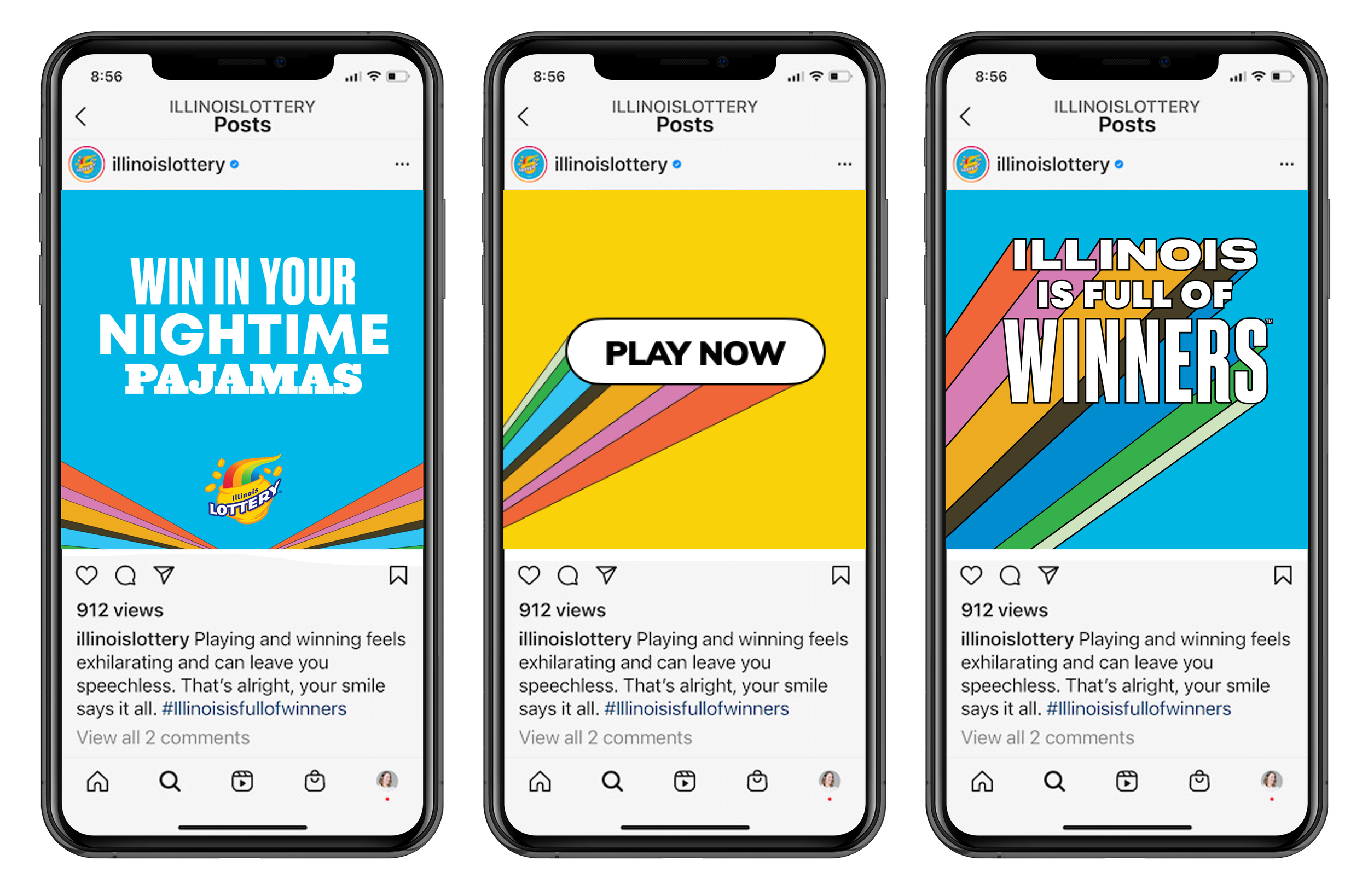
THE RAYS
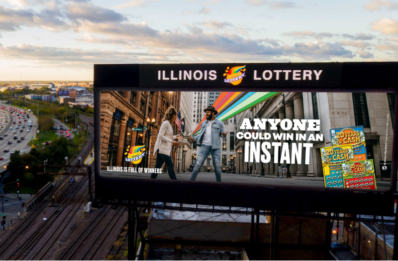
The rays are a distinctive visual asset that represents the fun, excitement and winning energy of the Illinois Lottery brand.
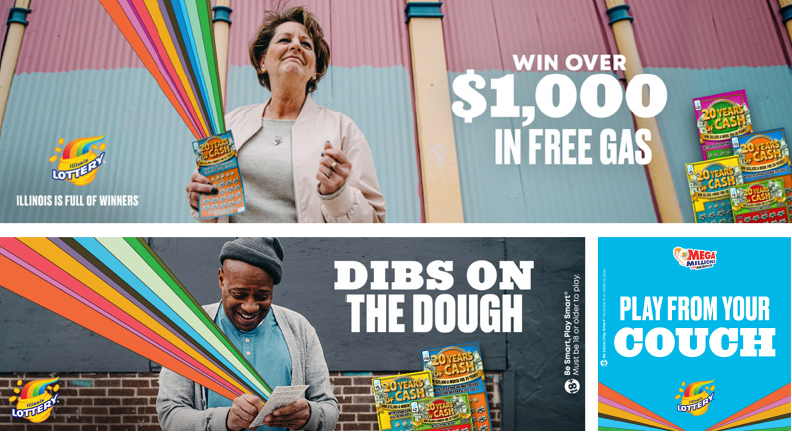

PHOTOGRAPHY
Real, authentic, organic. Our photography captures real Illinoisans in their natural element in scenarios that are relatable.
Our docu-style of photography allows us to distinguish ourselves from typical lifestyle photography, giving us an overall feeling that is modern and familiar.


COLOR PALETTE
Cyan blue is the masterbrand anchor color. It is bold, vibrant and modern. Product colors convey the full spectrum of the rainbow present in the Illinois Lottery logo and bring to life the variety of fun games that we offer.
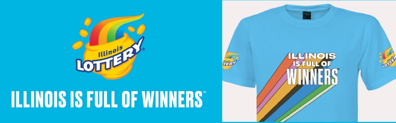
BRAND IN ACTION

TEAM:
GCD Design team: Marian Williams; Sr Designer: Sam Baliga; Designer: Margaret Kots
GCDs art & copy: Dave Petti & Bob Jensen
CD art & production: Susan Graan
ADs: Danny Weilandt, Danny O’Donnell & Ed Diaz
Copywriter: Michael Craighead & Crystal Mason