creative direction + design

pillars of simple bold design

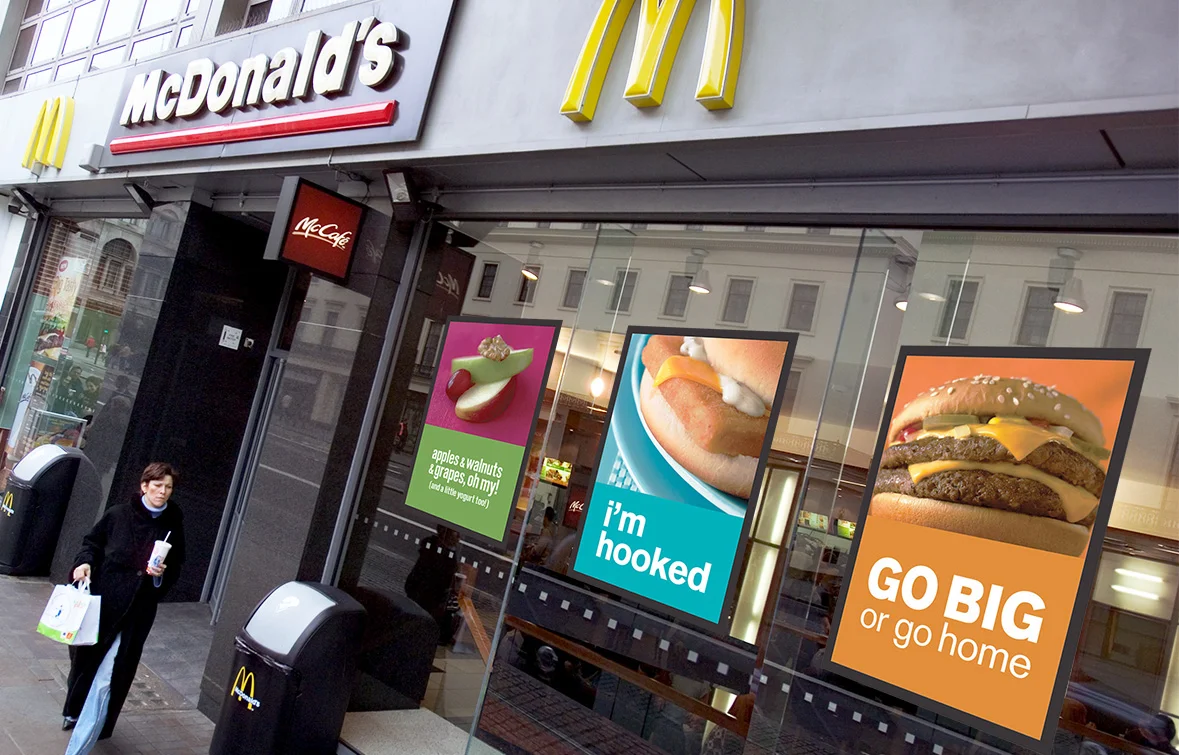
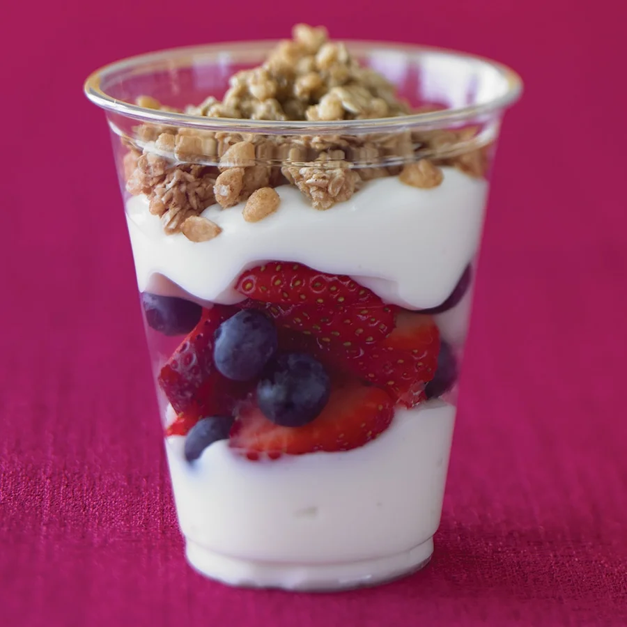
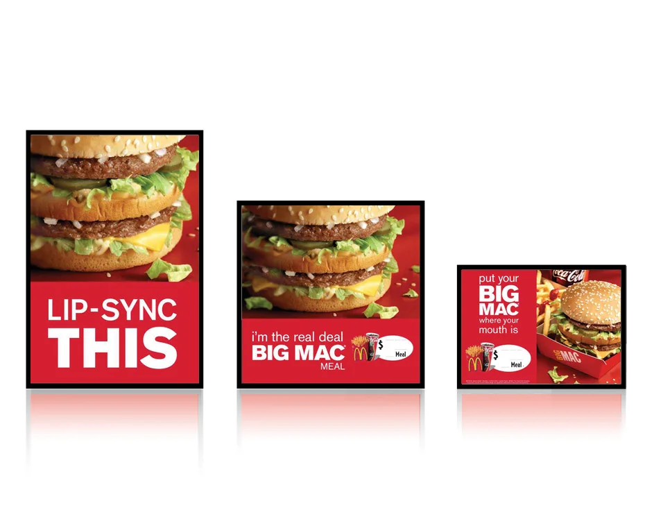
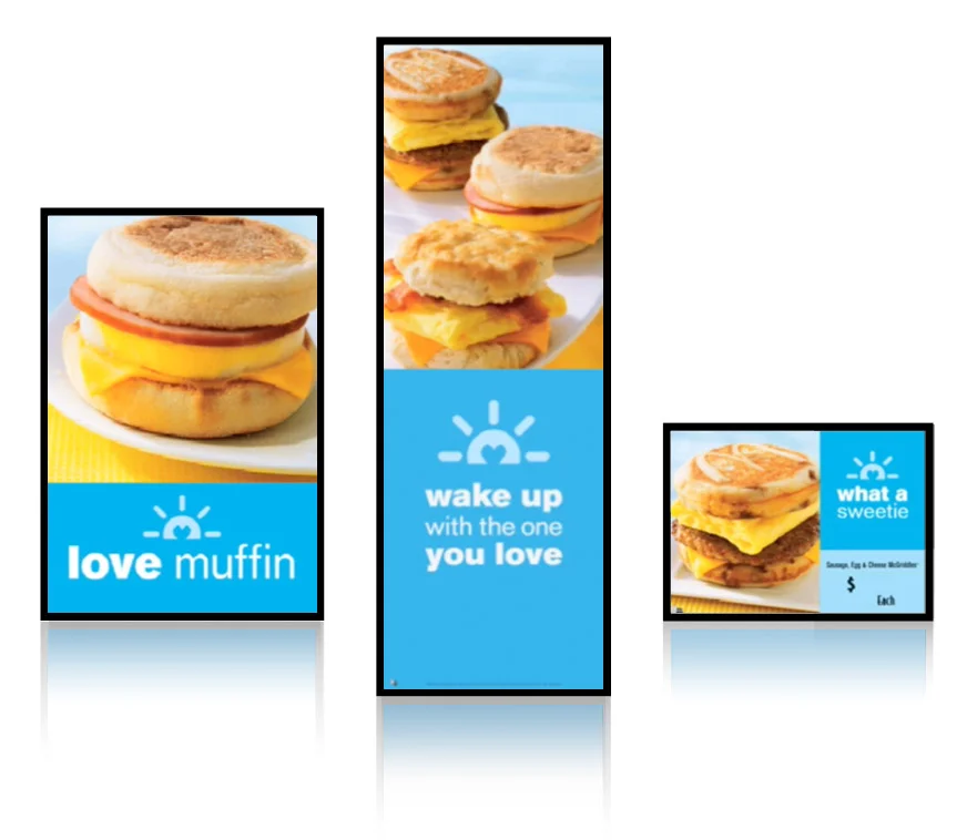
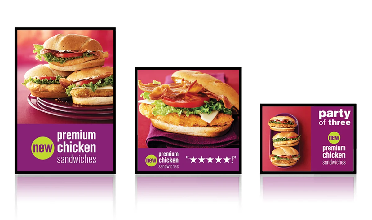
photography
- Uses natural lighting in photos so the food looks real.
- Food is the centering focus. It is the single most important cue and is the foundation of every choice we make in simple bold design.
There is one story to tell in every image—introduce this food to the customer.
- It isn’t arty or plastic; it is natural and inviting. It doesn’t rely on props or outside cues to say what it is; it shows off its own ingredients and personality.


color
- Harnesses a bold, vibrant, jewel-tone color palette to provide energy and freshness.
- The food itself inspires the background and secondary colors used in the design. Often the color speaks to an important product attribute; other times an unexpected color is most compelling.


layout
- A simple, modular layout groups information into zones for a clearer communications structure.
- Give everything its own breathing space.
- Form is function. Provides clear guidelines but allows flexibility.
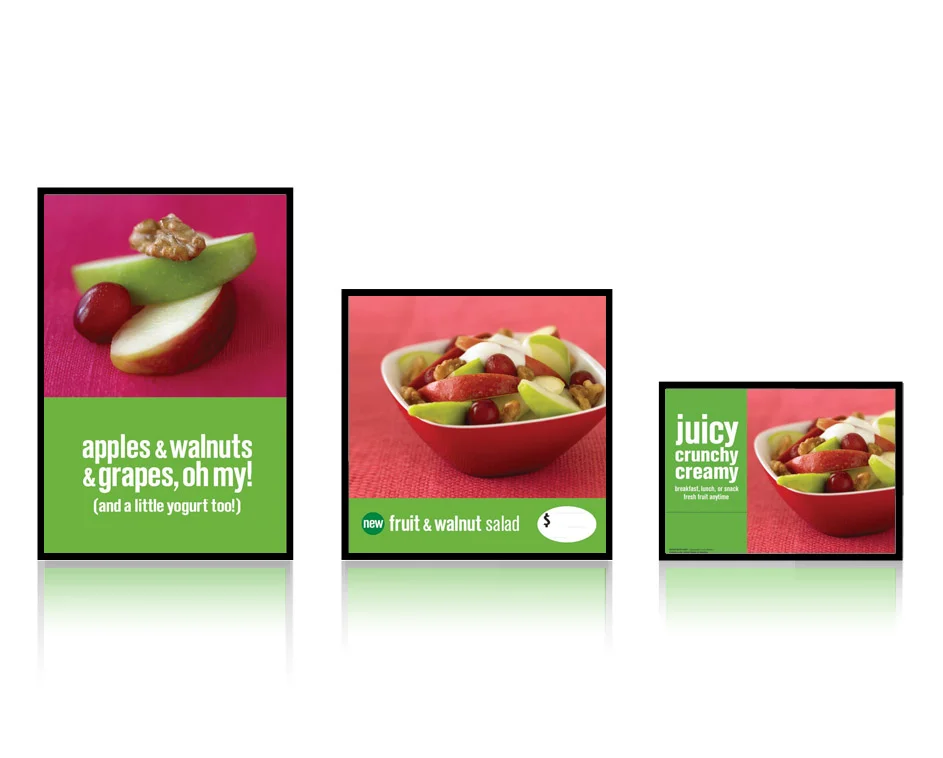
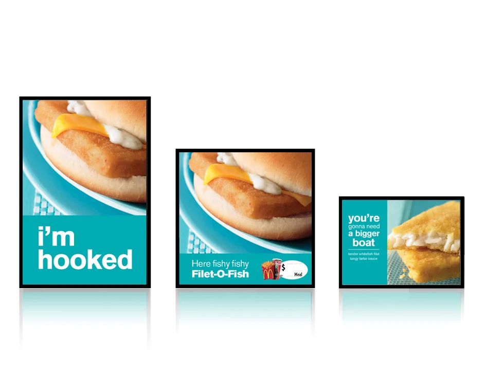
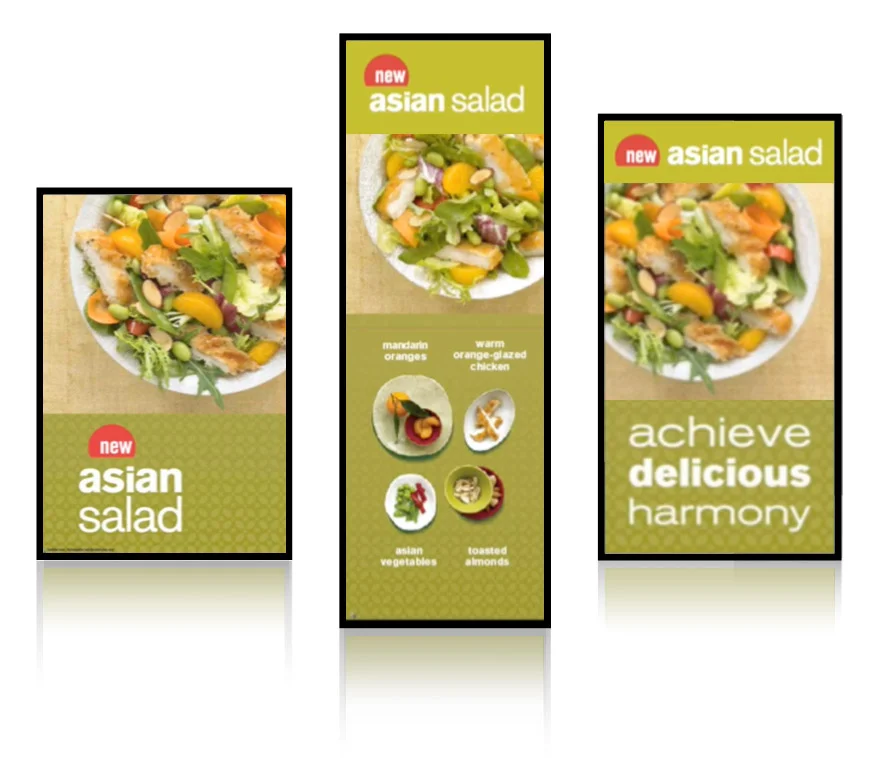
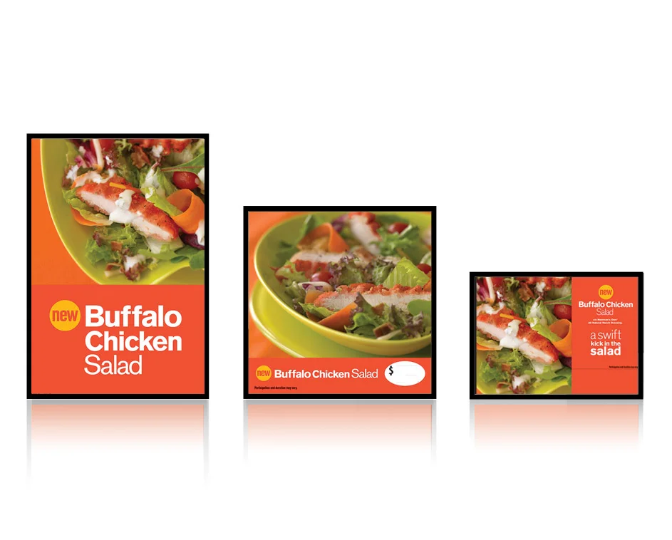

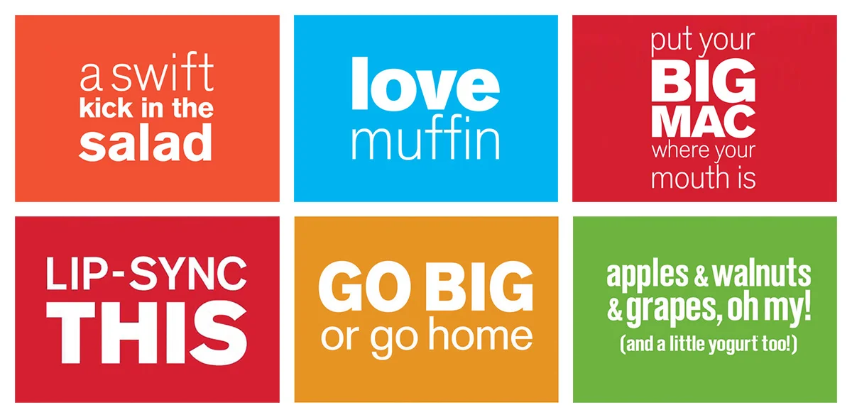
language
- Fun conversation language. A brand voice reflects McDonald's Brand Promise of simple, easy, enjoyment. Most important, it is consistent in tone and expression across all the different communications.
- Language engages us on two levels: informing and connecting. The information component is straightforward. The connection is made through how we provide the information. The language is familiar, friendly, witty, and sincere.
typography
- One font and a distinctive tone of voice to further simplify the impact of the message.
- White clearly reads against the jewel tone type zone.
- The design of headlines and copy blocks create emphasis on the most important information and become graphic
elements themselves.
in action
93% of new Premium Chicken sales are attributed to Simple Bold merchandising.
That's $192 million in Premium Chicken sandwich sales over a 5 week period.

style guide
- Followed by 100% of McDonald's local agencies.
- Impacting global standards.


TEAM:
SVP CD: Jim Carlton
VP CD copy: Carol Summerfield
CD art: Matt Denten
ACD art: Susan Graan